Want Great UX? Use Your Words

Posted September 10, 2018
Sixty years ago, Volkswagon's "Think Small" campaign changed the copywriter-designer work model. Today, digital companies are rediscovering the value of creative synergy.
A brief history of human accomplishment
"If I have seen further it is by standing on the shoulders of Giants." — Isaac Newton
Isaac Newton's lifetime accomplishments earned him a spot among the uppermost echelons of mankind's best scientific minds. But his famous quote was his way of humbly admitting it wasn't mere personal brilliance that got him there. He had the work of every scientist before him to draw from and build upon. Even the quote wasn't wholly his; it originated in the work of 12th-century scholars and Greek mythology.
The bottom line: Today's breakthroughs, regardless of the discipline, are reliant on the discoveries of those who came before.
And so it is with UX. Advertising and user experience are fundamentally different, but they both rely on creative minds for execution. And to some extent, both use concepts grounded in psychology and sociology to select the words, images, and symbols that best resonate with their intended audience.
Borrowing from the DDB playbook
In 1958, the DDB Agency launched an ad campaign that forever changed how copywriters and designers work together. Prior to the "Think Small" campaign, creatives were often siloed. After the campaign, which Advertising Age recognized as the greatest to date, copy and design working in tandem to set tone and capture readers' imaginations became the norm.
Sixty years later, UX has grown in importance to the point user-oriented has replaced merely functional as the baseline for digital product development. Designers already play a prominent role in adding usability to digital products. But in the past few years, UX product managers like their creative director brethren before them have realized the value of bringing UX writers in at a product's inception.
Why add writers to the UX team?
Writers belong in the mix for the same reason copywriter Koenig and art director Krone's "Think Small" pairing worked: they create a more cohesive reader (or user) experience. Writers' empathy for users, combined with their understanding of design and functionality, informs the calls to action, error state messages, notification messages, onboarding instructions, and tooltip prompts users encounter in apps, websites, and microsites.
The contrast between these elements written by a UX writer or a team member with no specialized training can be the difference between a mediocre and great user experience.
What makes a great UX writer?
There's no single answer to this question. But the ability to think like a user and translate that empathy into written cues and instructions is a good start — even in the smallest pieces of copy. In fact, copy elements such as calls to action, etc. are all considered "microcopy." The little snippets of instructions and help text that microcopy comprises differ from site to site, but written well it makes a big impact on usability.
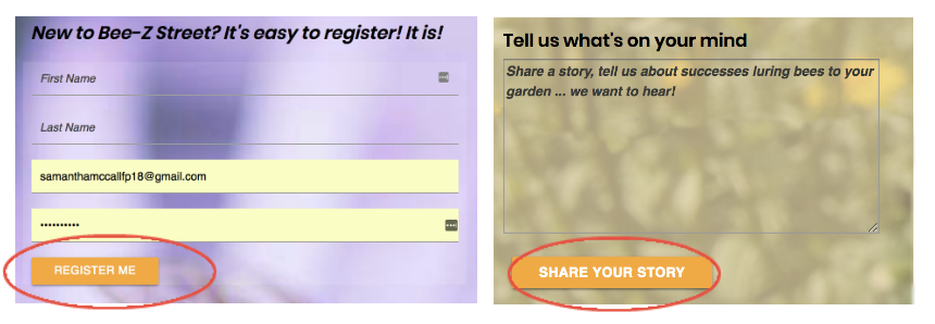
Thanks to stumbling onto a great article last May, "How to build a better product with UX writing" I was already thinking about microcopy when my team started working on our final team project. While working on Bee-Z Street, I tried to improve user experience with some subtle tweaks to the buttons and images I added to the site's Registration and Contact pages. In the first draft, the buttons below were both labeled "Submit":

These buttons now more accurately reflect what users can expect when
clicking them. Adding "Me" and "Your" also
personalize the experience. In a real-world UX environment, we'd use A/B
testing
a
cloze test, highlighter testing, or
a comprehension survey to see which version provides the best UX.
Button labels are just one microcopy element. But even this mini exercise helped me understand the importance of putting myself in the users' seat and ensuring every website element — no matter how small — is created with a great end-user experience in mind.